Matamerism
Desiring to do the very best that we can, we look for resources in every facet of the models we build. When it comes to getting a color right, it is always best to go to the source. In the case of the Northern Pacific Railroad, we are blessed to have the actual color cards, or ‘Drift Cards’ as they are known. Provided by the NPHS, this is a very valuable resource. But that resource is only as good if you can hold a factory’s feet-to-the-fire so to speak, insisting that the color sample they give on a preproduction train is to our liking.
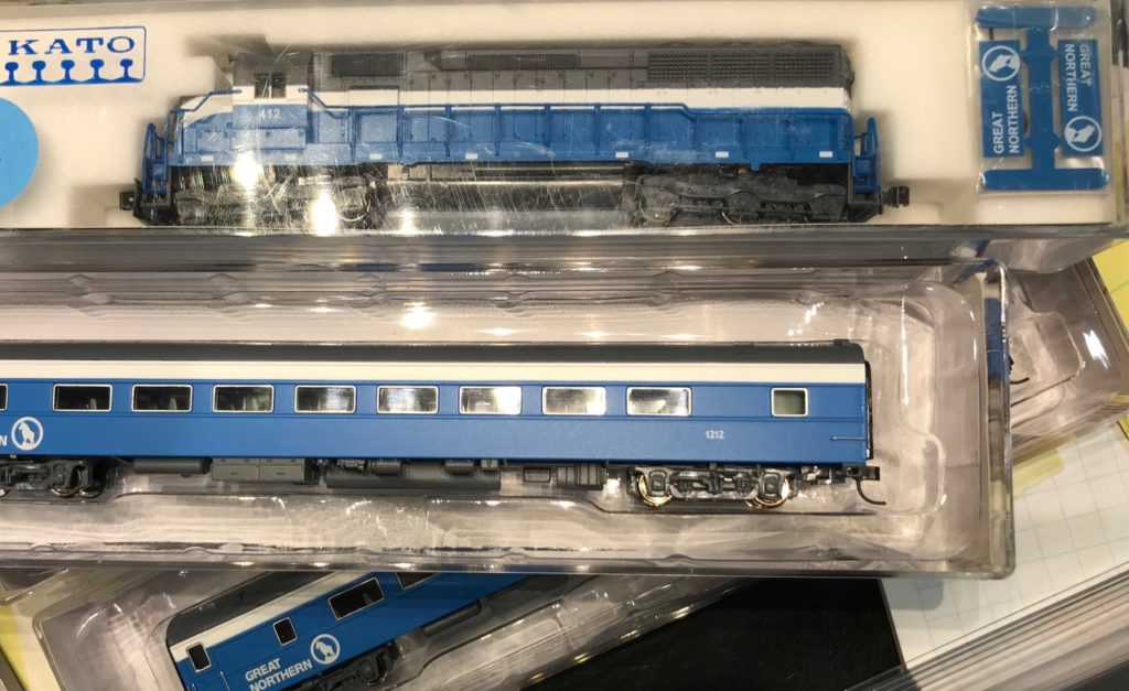
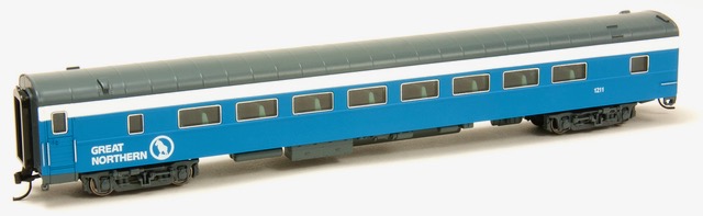
For the current production release, this batch of coaches for the Illinois Central train, “City of Miami“, and the Great Northern’s Big Sky Blue, we do have several Pullman books with color samples to use. But how do these colors compare to what has been done previously in our scale? (Can you scale color? That is a topic for later.)
Looking at other production runs of several well-known N Scale manufacturers, it is easy to see arguments as to what they think is right. For Big Sky Blue, I found that both Kato and Micro-Trains agreed on the blue. We agreed with the Kato BSB gray, so we sent that sample to our factory to match. For the IC ‘Panama’ colors, as they are known, we only went to the Kato bookcase sets they produced about ten years ago. They appeared to match the Pullman book colors close enough to follow. The prior Walthers run used a true brown which we know was not right, and MicroTrains used an almost maroon which, in our opinion, was too red. We think that our factory knocked the ball out-of-the-park with this batch of passenger cars. We are very sure you will agree! Big Sky Blue and the IC City of Miami will be a perfect match, if you have these well-loved other brands.
The point is this, if prior trains produced are painted well and look right to the Drift Cards, it is best to match those so that you have continuity in your train. Matching colors often creates arguments, but why other than to justify what you purchased. You are seldom standing in front of the actual train to compare colors to a model. And, if you were, is it fresh paint? You can use the argument that a version has a sun-faded effect. And, by the way, you know that colors fade in sunlight so never get darker.
So what about Matamerism? Look that word up! Matamerism is defined: the way that light effects how we see a color.
At the end-of-the-day, a railroad’s actual Drift Cards, or Drift Cards used by the Pullman-Standard Company are always the best way to match a production run that needs to follow a prototype train.
Remember what I said about ’scaling a color’? Just read the above and everything else is ‘just for arguments’ sake.
Happy Rails! We are committed to bring you the best we can!